
Role: Product Designer, UI/UX
Timeline: July 2026 – Ongoing enhancements
Medium: Interactive Web App
Tools: Figma, Adobe Illustrator, Claude
Context: A rental search companion that keeps apartment hunting organized, from first save to final viewing.
Overview
KiezKeys is a rental search companion designed to make apartment hunting easier to manage. It brings saved listings, applications, documents, and viewings into one organized place, helping renters stay on top of what’s next.
The Problem
Finding apartments isn't the hardest part.
Applications, documents, landlord conversations, viewing dates, and follow-ups quickly become scattered across different tools.
The real question became:
“I've found several apartments. How do I keep track of all of them?”
Opportunity
Instead of building another marketplace, I explored an operating layer for the rental search.
Something that helps renters manage everything that happens after discovery.

Understanding the User
Start with one user.
I focused the MVP on the searching tenant rather than trying to solve both sides of the rental market at once.
Primary User : Renters
Berlin renters actively searching for an apartment, managing multiple applications, viewings, and documents.
Future: Landlords & Property Providers
Berlin landlords and property providers managing listings, applicants, and viewing appointments.
Product Strategy
An operating layer, not another marketplace.
The core product loop became:
Add Listing → Confirm → Save → Apply → Track → View → Decide
Instead of competing with platforms such as ImmoScout24 or WG-Gesucht, KiezKeys works alongside them.
The product answers one question:
“What needs my attention next?”
Key learning
Users need actionable context before detailed information.
This reinforced the decision to lead the dashboard with the attention feed rather than a traditional apartment database.
Design Response
I kept the dashboard focused on:
Action → Status → Details
rather than presenting every piece of information at the same level
Usability Study
Core workflow: Test the essential tasks first: adding an apartment, finding viewings, checking application status, and knowing what needs attention.
What I looked for: Whether users could navigate the dashboard easily, understand apartment status, find key actions, and complete the paste-link flow more easily than manual entry.
Key Features
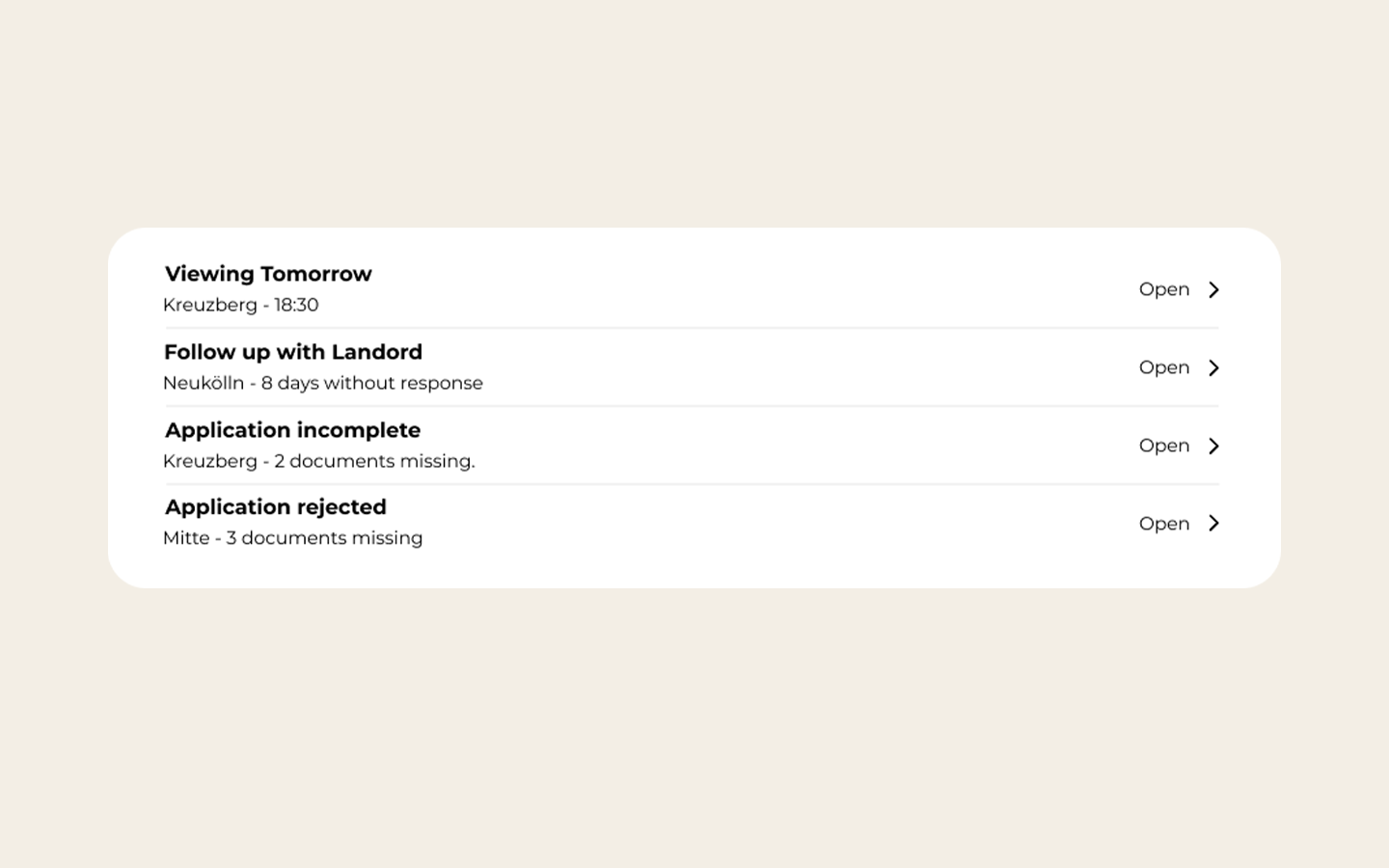
Attention Feed
A prioritized view of what needs action today.
Follow-ups, upcoming viewings, and incomplete applications appear before the full apartment list.
Goal: Reduce mental load.
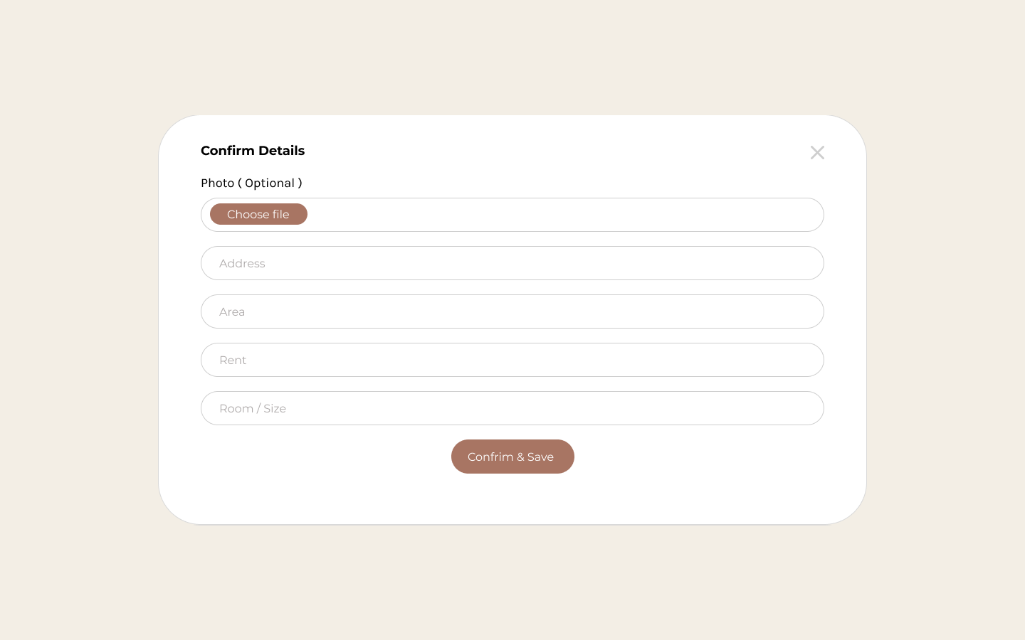
Paste a listing
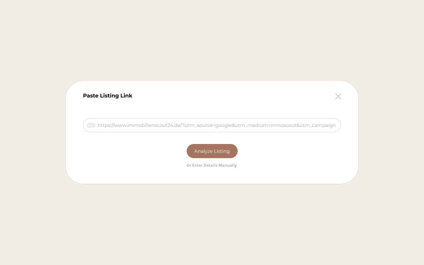
Copy a listing URL from another platform and let KiezKeys extract the important details.
Address · Rent · Size · Rooms · Requirements
The user confirms the information before saving.
Manual entry: Add apartment details manually when listing information cannot be imported due to website privacy restrictions.
Goal: Remove repetitive data entry.
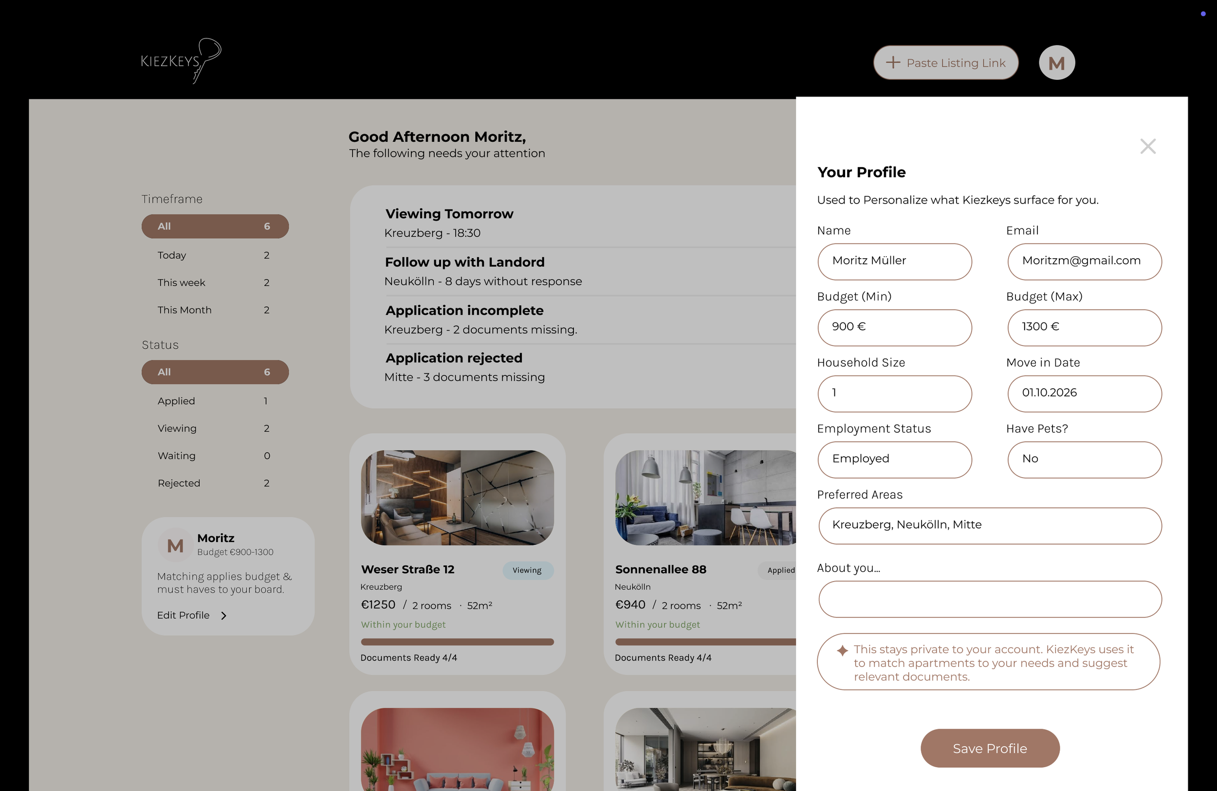
Profile & Preferences
Tell KiezKeys what matters to you.
Users set their budget, preferred areas, apartment size, and other priorities. KiezKeys uses these preferences to organize the dashboard and highlight apartments that are a better fit.
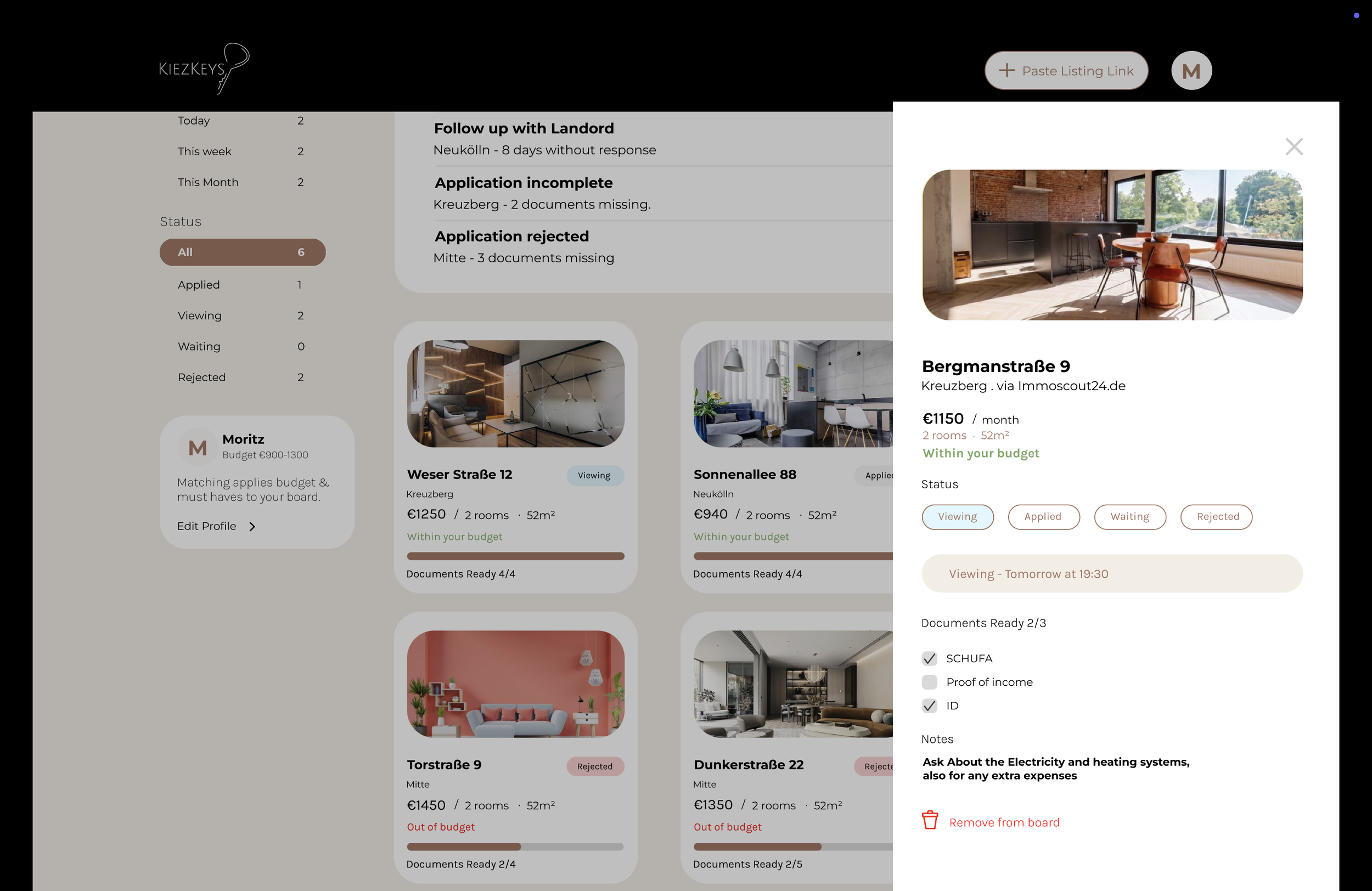
Document Readiness
Each apartment shows which required documents are available and what's missing.
4/5 documents ready
KiezKeys organizes documents but does not automatically send them.
Goal: Make application readiness visible at a glance.
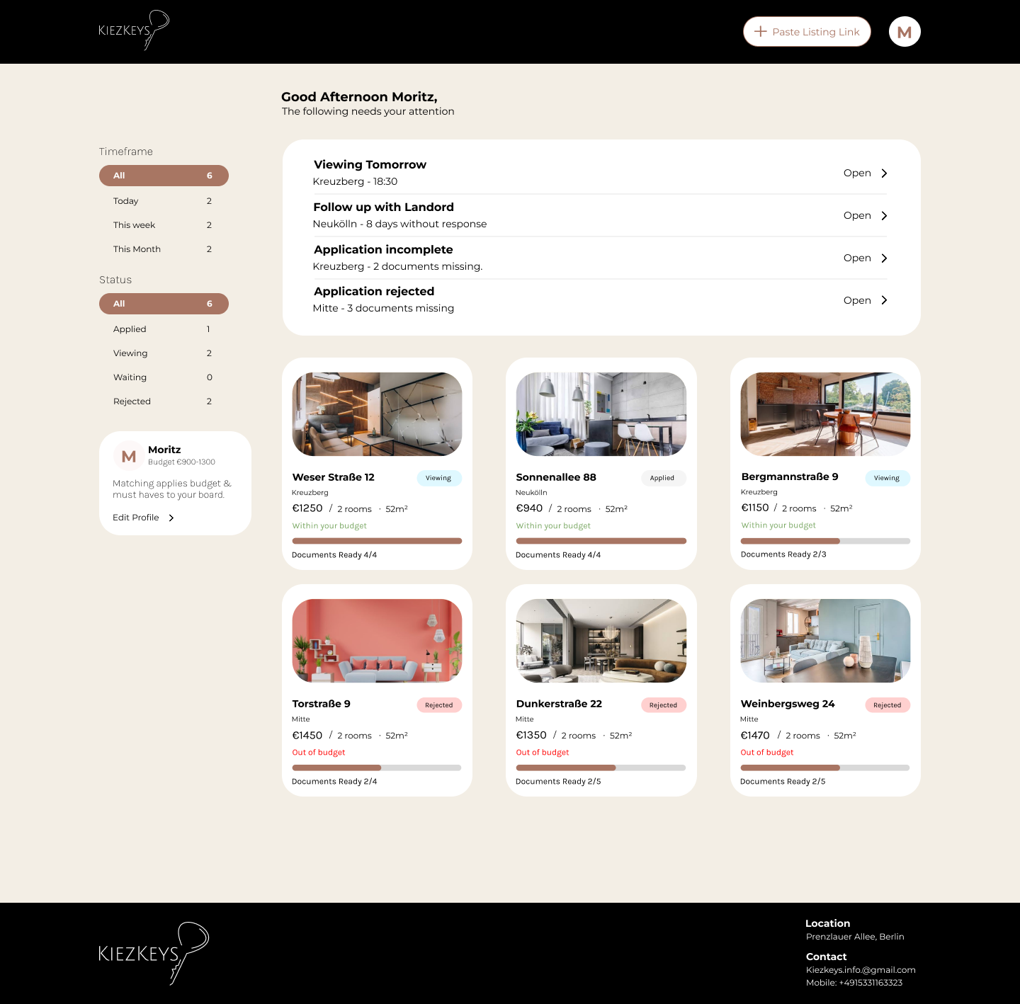
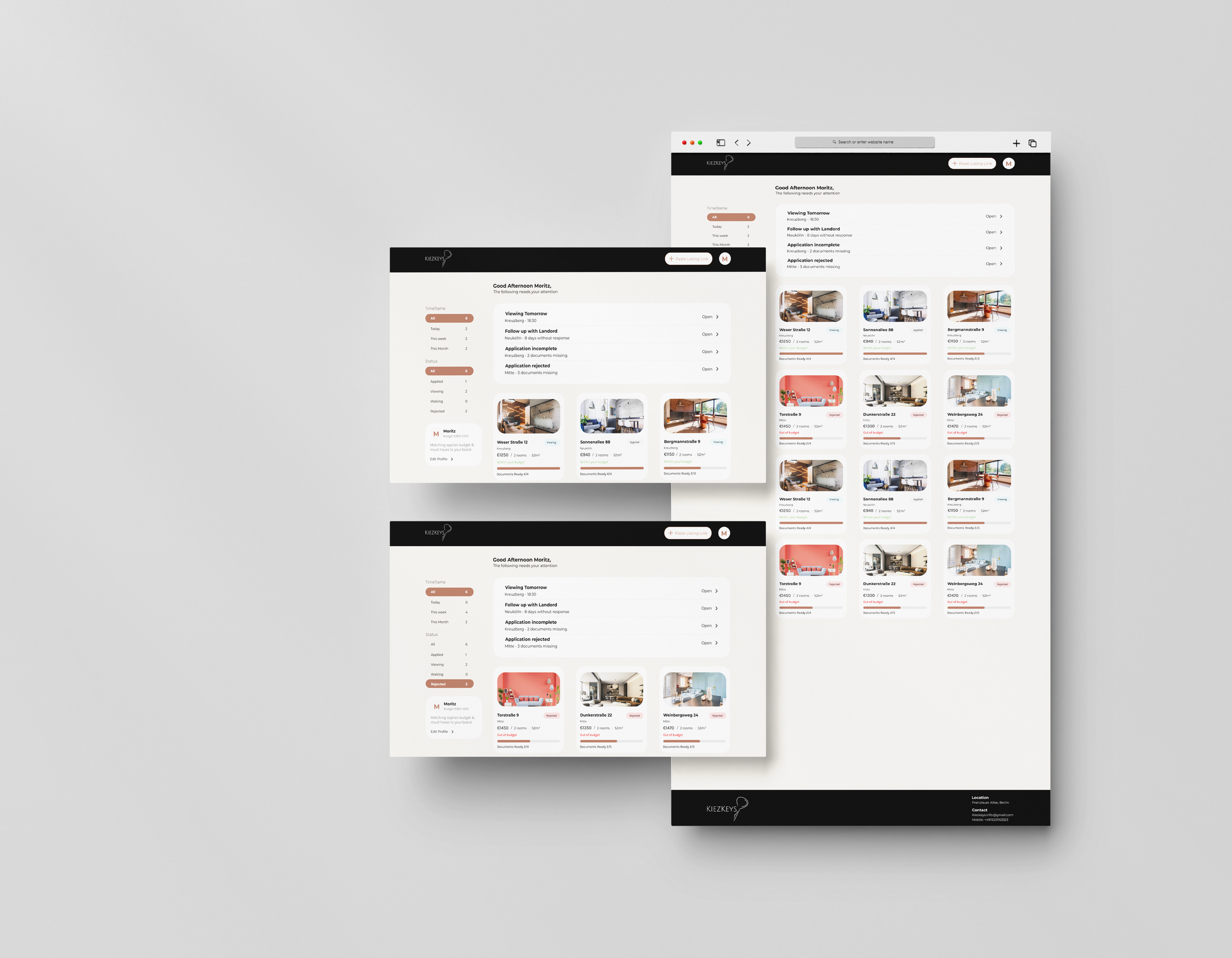
The Dashboard-Main Experience
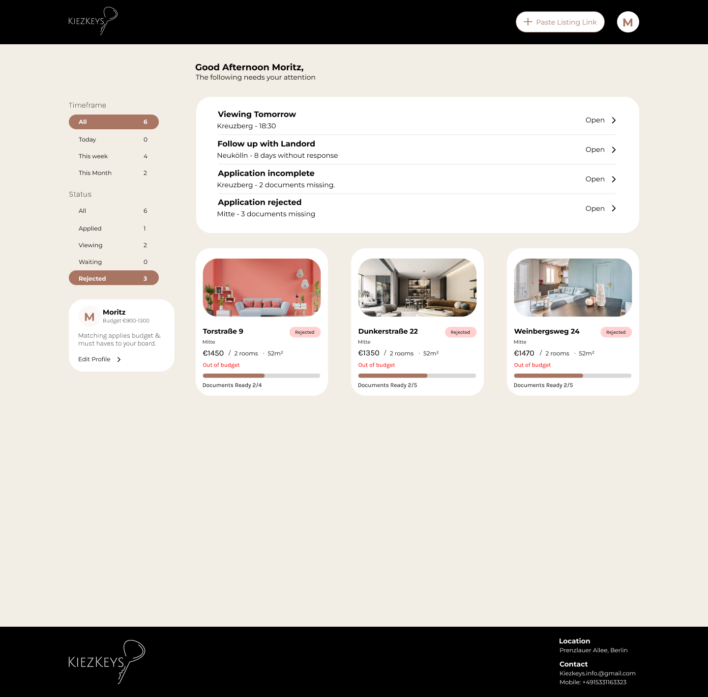
The dashboard puts attention before information.
Instead of showing 30 apartments as an undifferentiated list, it first surfaces what needs action.
Needs your attention
Follow up with landlord
Viewing tomorrow
Application incomplete
Apartment board
Users can then filter their tracked apartments by status.
Viewing · Waiting · Applied · Rejected
This creates a simple hierarchy:
What needs action → What's happening → Everything else
User Flow
From adding a listing to keeping track of the entire rental journey.
Add listing → Paste link or manual entry → Confirm details → Save → Apply → Track → View
KiezKeys gives renters two ways to add an apartment. They can paste a listing link and review the extracted details, or enter the information manually. Once saved, the apartment becomes part of their application and viewing workflow.
Colour Palette
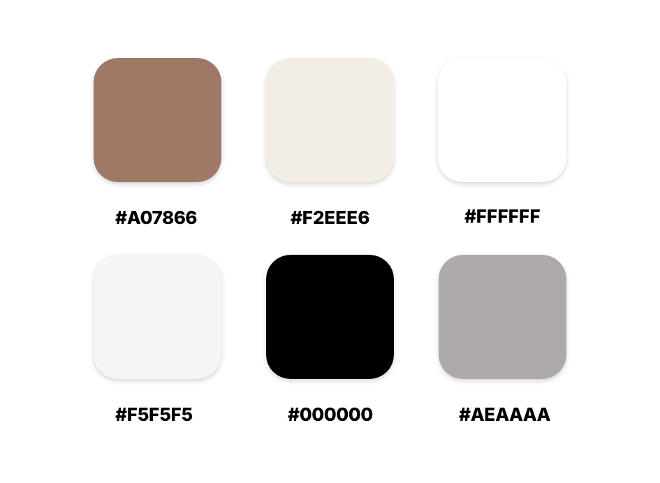
Inspired by the warmth of Berlin’s neighbourhoods, earthy brown and soft beige create a calm, familiar foundation, while black adds clarity and structure to the interface.
Typography
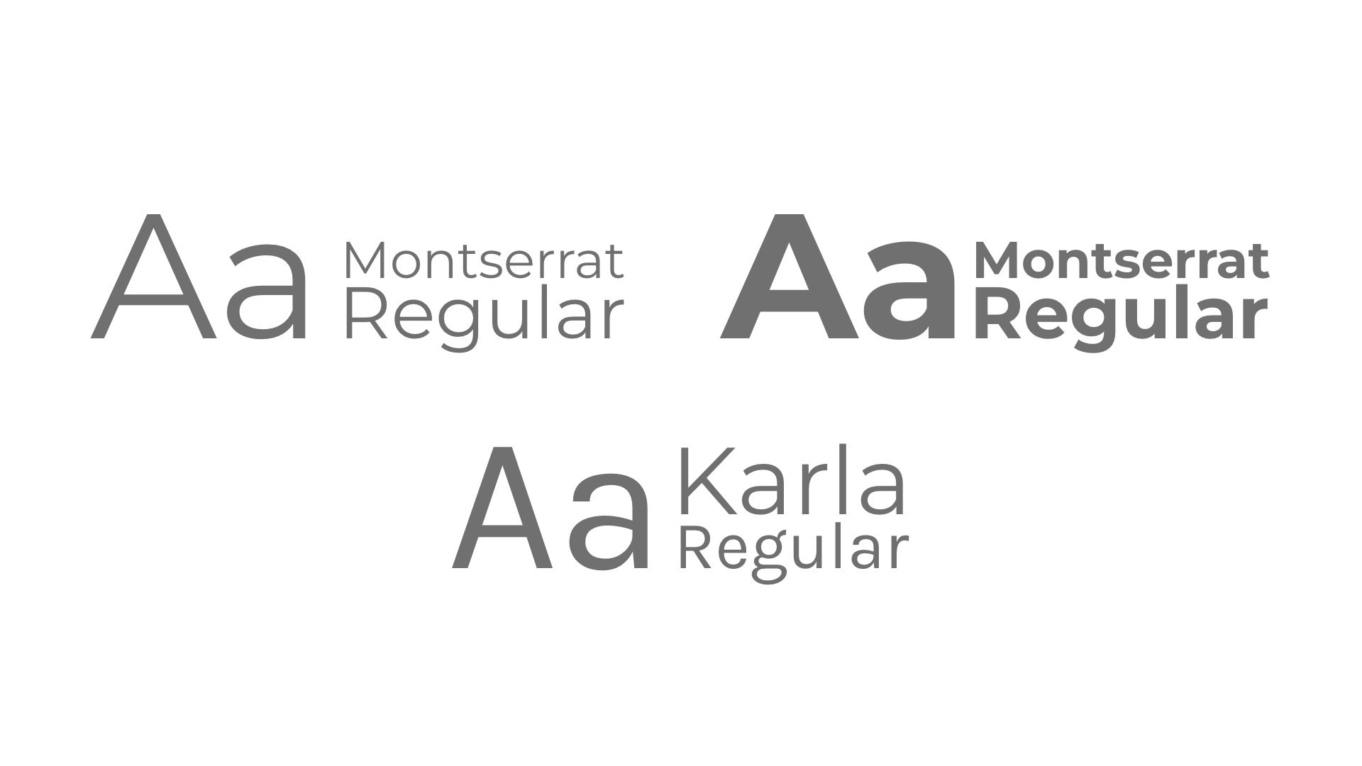
Montserrat is the primary typeface, using Bold and Regular to create a clear, modern hierarchy across headings and body text.
Karla Regular is used for supporting information such as status, timeframes, and labels, creating a subtle visual distinction from the main content.
Outcome
KiezKeys evolved from a simple apartment tracker into a guided rental experience. User preferences now influence how listings are matched, prioritized, and surfaced, helping users quickly identify suitable apartments and what needs attention.
Reflection
The project pushed me to think beyond individual screens and design the relationship between user needs, information hierarchy, and product behavior. The result was a dashboard that adapts to the user instead of simply displaying a list of apartments.