
Overview
A stock order, a gold purchase and a startup commitment may look similar in an app, but they do not follow the same rules. I reviewed an investing flow against relevant EU requirements, identified seven gaps and designed six groups of changes to make the experience clearer and more informed.
The Challenge
Phase 5 brought four investment types into one experience: stocks and ETFs, bonds, gold and silver, and startup commitments.
The original screens made these options look similar, even though the rules around them differ. Some flows allowed users to proceed without specific warnings, checks or information they might need before committing.
I took ownership of the design phase and extended the original task into an independent review of how relevant EU requirements could change the experience.
Findings
Investor knowledge: No knowledge check or loss simulation before a startup commitment.
Cancellation: No clear explanation of the four-day reflection period for eligible crowdfunding commitments.
Investment amounts: No additional warning, consent or evidence-of-understanding step for larger commitments.
Offer information: Missing standardised key investment information and a clear costs disclosure.
Stocks, ETFs and bonds: No appropriate notice or warning for situations where an appropriateness assessment was missing or a product was complex.
Gold and silver: No proposed identity-check step for larger orders and no explanation of when cancellation rights may not apply.
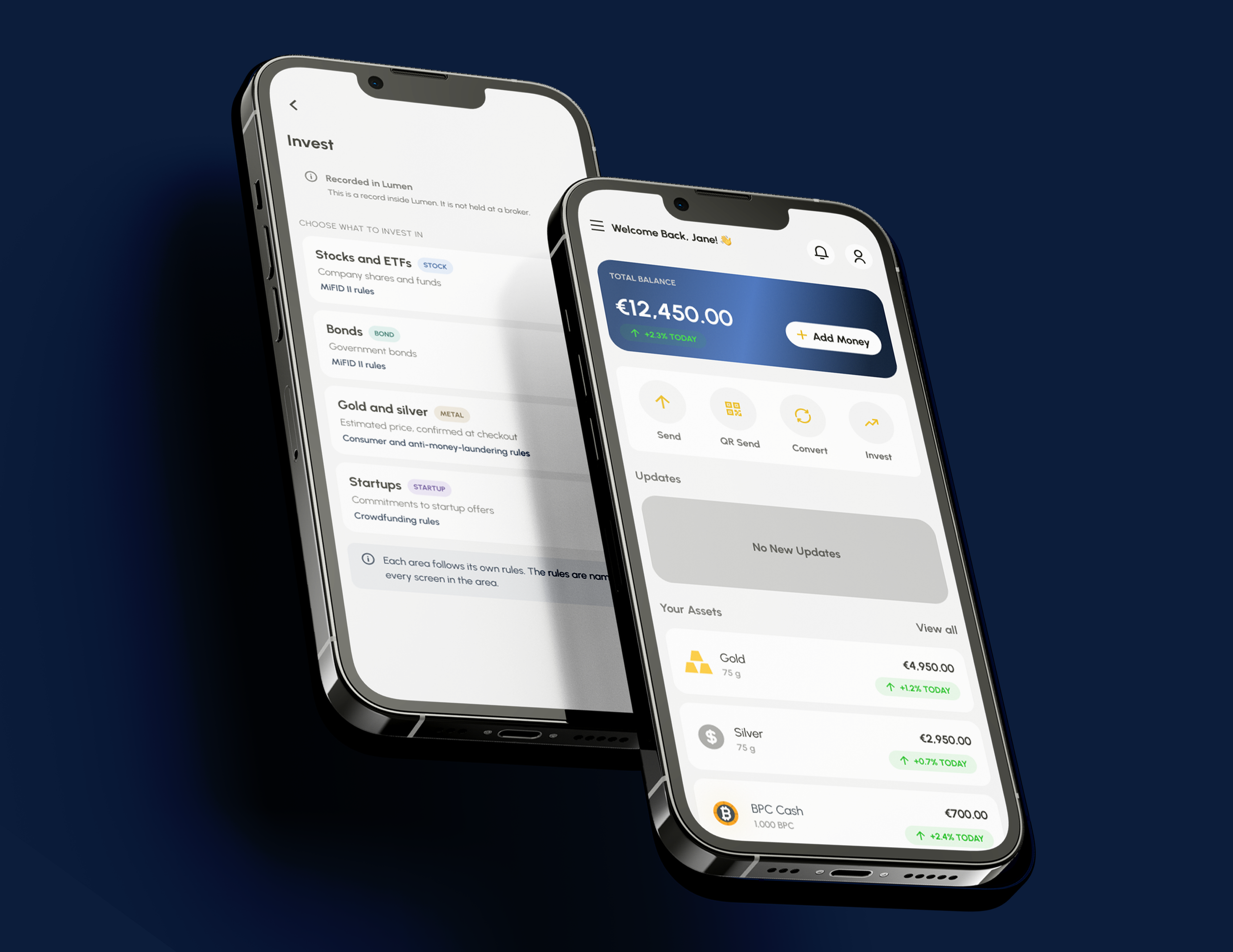
Product distinctions: The Invest hub did not explain that different investment types can follow different rules.
Note
These were findings from my design review, not confirmed legal violations. The exact obligations depend on the product, service and circumstances.
From Findings to Design
I created a separate Figma file with 48 proposed screens across six groups of changes. This kept the investigation separate from the existing product scope.
01 Investor Knowledge Check
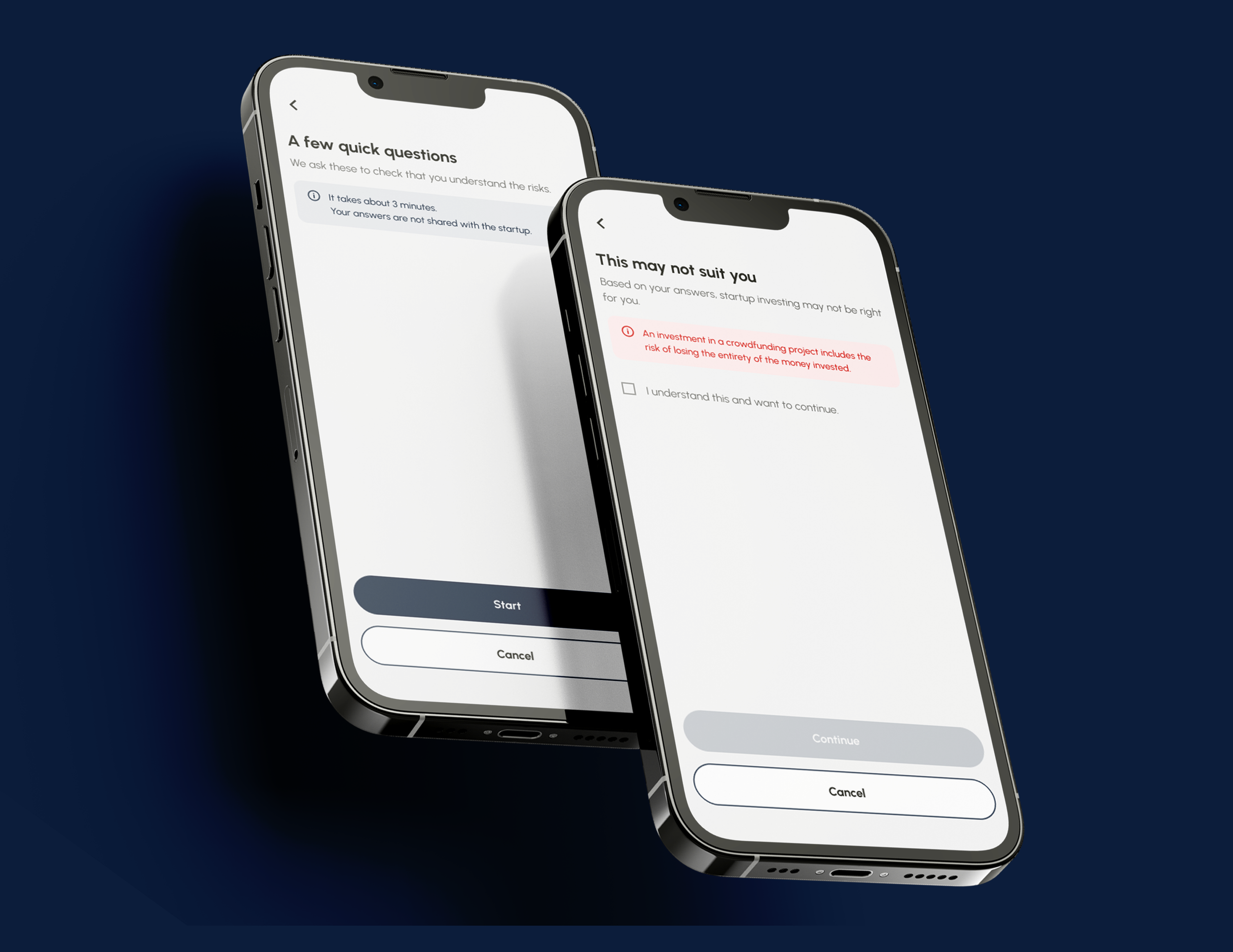
Image 01: Eight-question investor check, a loss simulation that shows what a loss could look like, and a repeat-check state.
I designed an eight-question investor check covering experience, goals, knowledge and understanding of risk, alongside a loss simulation.
The experience includes risk warnings and a repeat-check state. The questions are drafts based on regulatory requirements, not a legally approved assessment.
02 The Reflection Period
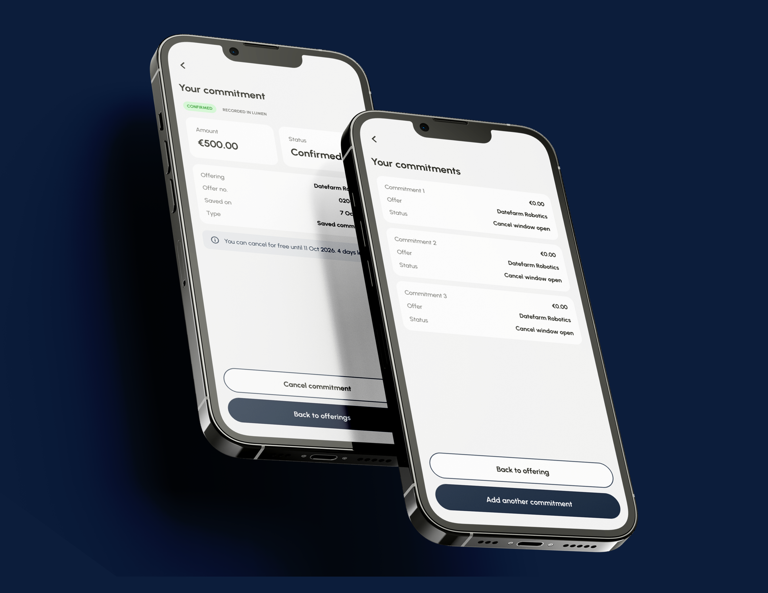
Image 02: Four-day reflection period explained before the commitment is confirmed, plus added consent steps for larger amounts.
I redesigned the startup commitment flow to explain the four-day reflection period before confirmation and show the relevant information on the commitment record.
For larger commitments, the flow also introduces a risk warning, explicit consent and evidence of understanding. If the required evidence is missing, the proposed flow blocks the amount and explains why.
03 Clarity of Offer Information
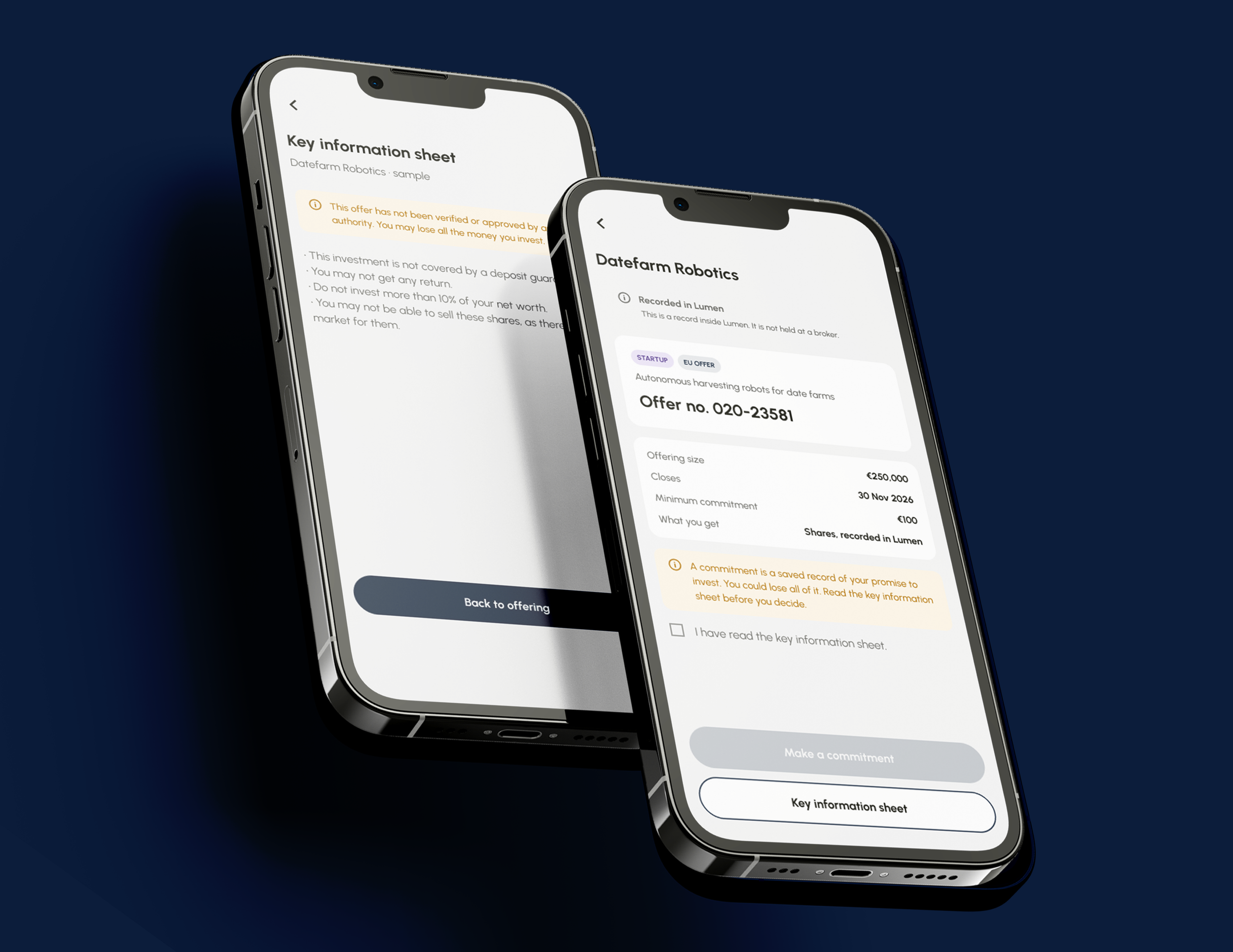
Image 03-Key investment information sheet and review screen with a costs line.
I added a key investment information sheet to the startup offer, a costs line to the review screen and a read-confirmation step before commitment.
The sheet uses placeholder copy. Both its legal wording and the sufficiency of the confirmation step require review.
04 Appropriate Investment Warning
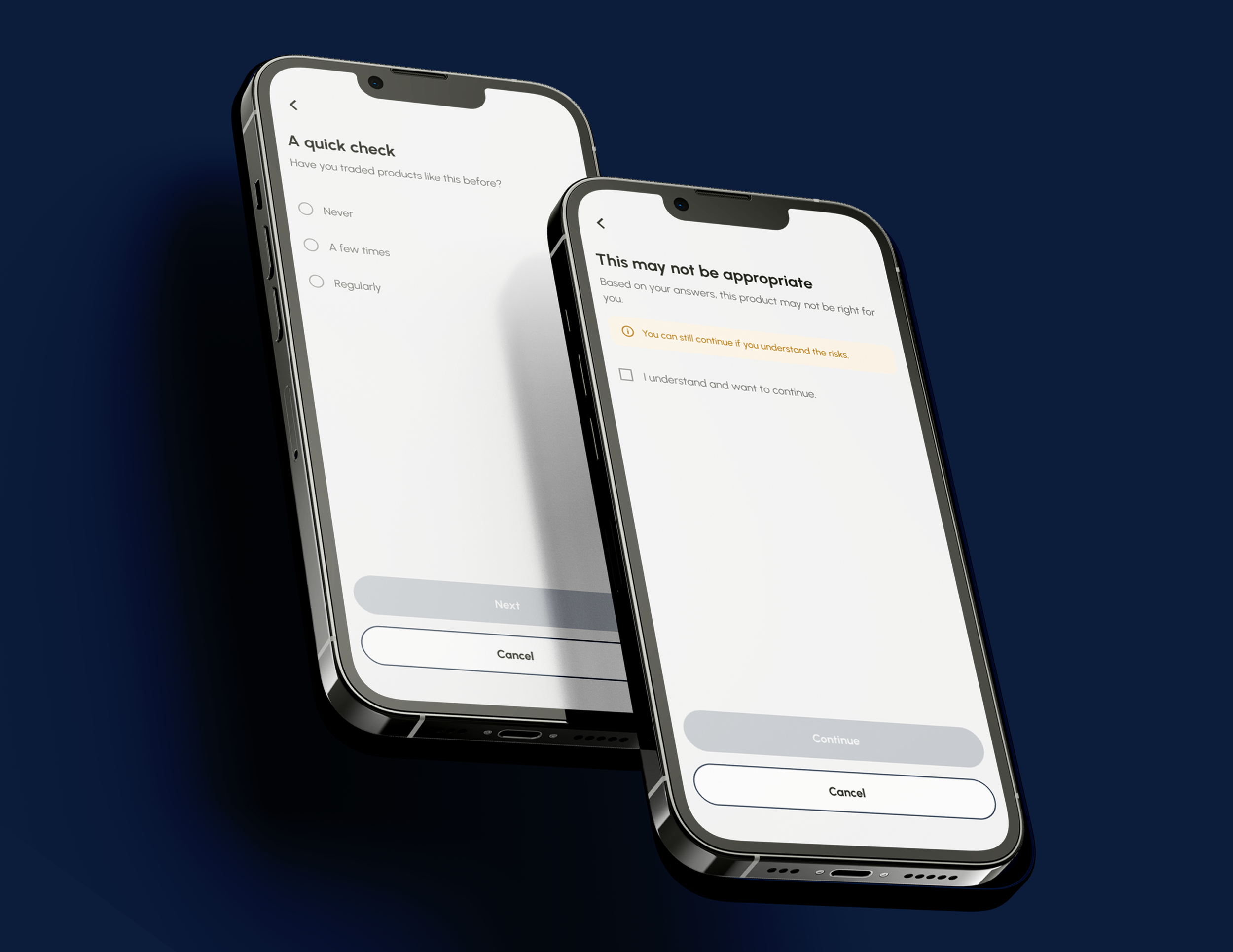
Image 04-Warning state for stocks, ETFs and bonds when an appropriateness assessment is missing.
For stocks, ETFs and bonds, I designed states for situations where an appropriateness assessment has not been carried out and additional checks or warnings may be needed for complex products.
The final treatment depends on the product classification and applicable requirements.
05 Clarify Gold & Silver Purchase
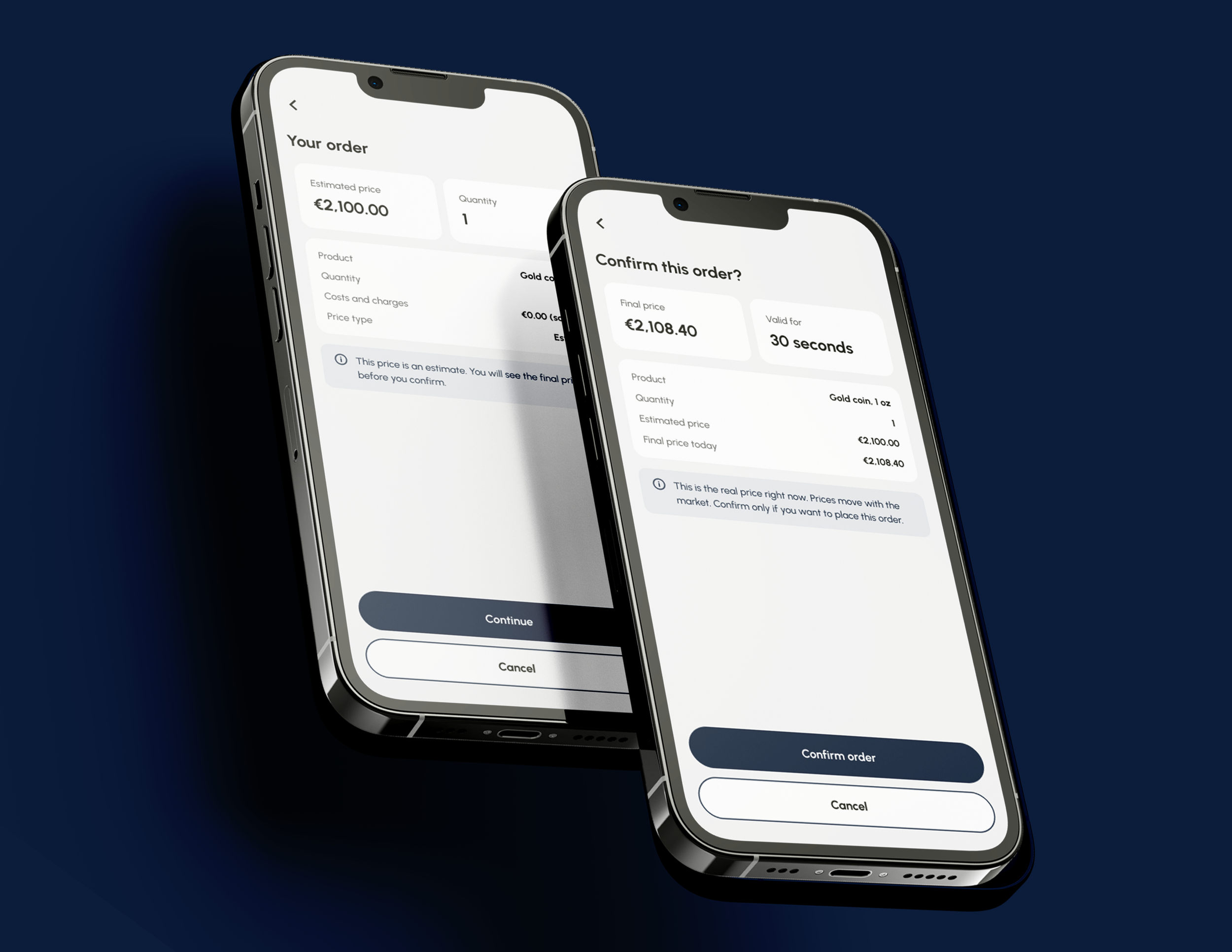
Image 05-Estimated price shown separately from the final price, with an identity check for larger orders.
I separated estimated pricing from the final price shown before confirmation, added an identity check step for larger orders and explained that cancellation may not be possible in certain circumstances.
The proposal assumes a physical-metal purchase. The appropriate threshold, payment method and legal classification still need confirmation.
06 Distinguish the Investment Types
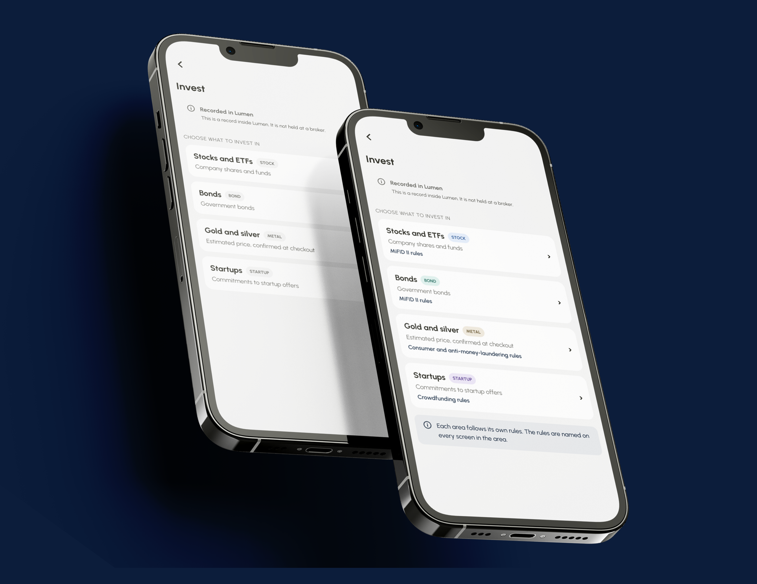
Image 06-Invest hub with labels explaining the different rules for each investment type.
Rather than adding another page, I kept the existing four-row Invest hub and added labels explaining the different rules associated with each category.
The aim was to make the distinction visible at the point of navigation and consistent throughout each flow.
Before & After
Seven areas of the investing flow, before and after. The last column names the EU rule that drove each change, so every design decision traces back to a requirement.
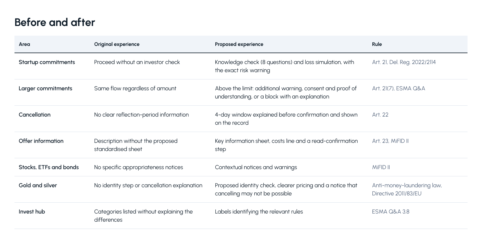
Before & after table: These design changes show investors the risks, limits and consent steps at the point they need them, rather than at the end.My Role & Approach
I joined as a product design intern, but with no clear owner for Phase 5, I took responsibility for organising and driving the design work.
I created a naming system for the mobile and web screens, maintained a 35-row assumption log and documented unresolved decisions and questions for the relevant legal and business stakeholders.
I also went beyond the original design assignment by researching relevant EU requirements and translating them into proposed interface changes. During my review, I caught inconsistencies in dates, US-specific wording and an amount that differed between two screens.
I used AI to help organise research and find sources, but I made the design decisions myself. Where possible, I checked the primary legal texts and documented where I relied on secondary summaries.
What Still Needs Validation
These screens are my own design proposals, not legal advice or proof of compliance. Before implementation, they would need:
Legal and compliance review. Specialists should confirm the product classifications and the applicable requirements for each offering, including crowdfunding, shares and precious metals.
Review of the user-facing duties. This covers the risk warnings, the key information sheet, the cancellation rights and the identity checks.
Verified thresholds. Investment limits and similar figures should be checked against the latest consolidated regulations, since they can change.
Usability testing. The flows should be refined based on what the tests show. Testing is in progress.
What I Learned
A rule can change a button, not just a screen. Moving a limit check or a risk warning from the end of the flow to the amount step changed the whole order of the journey. I only saw this by building the prototype, not by reading the regulation.
Being PM and designer at once forced real trade-offs. I had to decide which gaps to fix first and which to log as assumptions, instead of designing everything.
Proposing is not the same as being compliant. I could show where the flow differs from the rules, but only legal review and user testing can confirm it. That is why I called the work a proposal.
I'm testing the clickable prototype with five participants across five tasks: finding a holding, ordering a stock or ETF, buying gold, committing to a startup and finding a past order.
I'm looking at whether participants can complete each task and understand the warnings, using comprehension questions and the System Usability Scale. The prototype uses sample data, so no real money or personal data is involved.
Results are not yet available. I'll add the findings once testing is complete.